Sorting and Colouring 1,000G Data to Investigate Population Structure
We have made some major improvements to the charting and visualization features in Mosaic. These allow us to create charts comparing attributes with each other, use colour to highlight attributes in a chart, sort data with charts, amongst others. In this tutorial, we will use the 1,000 Genomes Project to walk through some of these features, and demonstrate how easy it is to better understand your data. To start the tutorial, we need to log into Mosaic, select the 1,000 Genomes Project and then jump to the Analytics view using the left menu.
New chart types are now available
In this tutorial, we need some specific charts to be visible in the Analytics view, so, as a first step, we'll choose the charts that we want to see. Click the Select Charts button at the top of the Analytics page to open a modal where we can choose the charts to view. First, deselect all the currently selected charts (using the button at the top right), then select the following charts to view (note that there are multiple pages of charts - you can cycle through the pages using the controls below the table):
- Het Hom Ratio
- Median Read Coverage
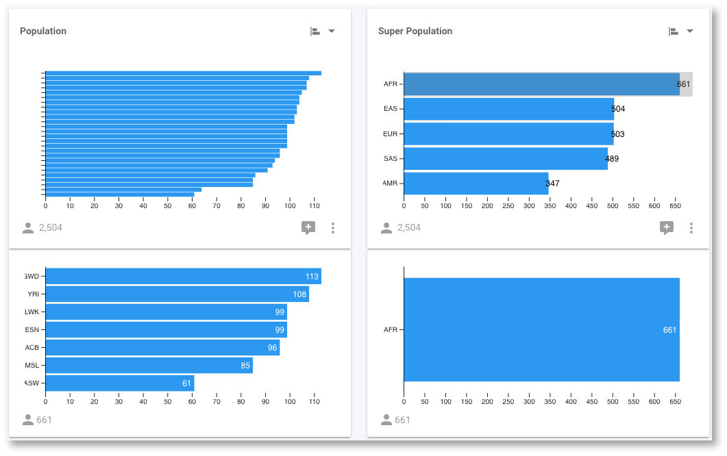
- Population
- Super Population
- Ts/Tv Ratio
- Het Hom Ratio
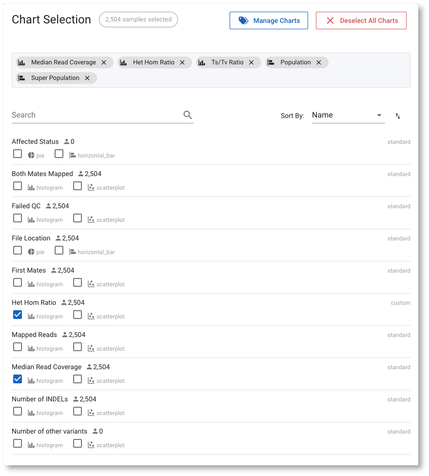
The available chart types depend on the data type, and are shown below each attribute. You can choose one chart type from this modal, but you can modify this choice for each chart at any time later. Once we Submit our selection, we see the charts displayed:
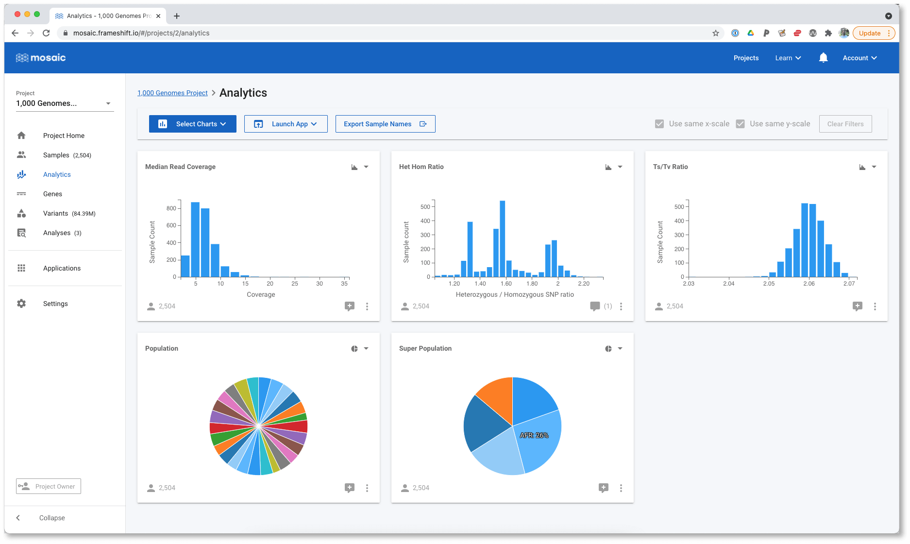
The Super Population is displayed as a pie chart, but it can often be difficult to accurately compare the sizes of each wedge. Let's modify this to a horizontal bar chart using the control in the top right of each chart.
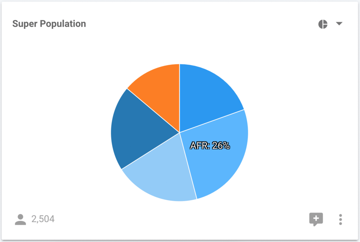
It is much easier to perform accurate comparisons of the population sizes with the horizontal bar chart. Regardless of which chart we are looking at, we can still interact with them in order to filter the data. For example, we can select the AFR super population in either the pie, or the bar chart and determine that it consists of the YRI, LWK, GWD, MSL, ESN, ASW, ACB populations.
New visualization features
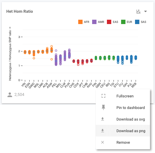
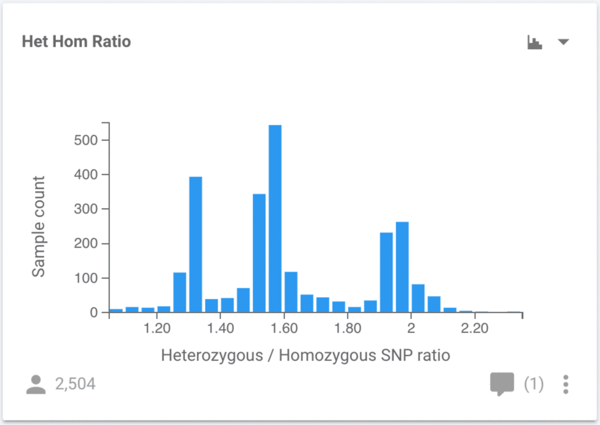
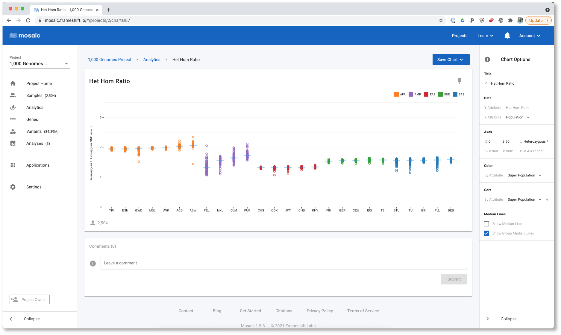
In addition to new chart types, we also have much more control over the charts. To demonstrate some of these features, we will look at the ratio of heterozygous to homozygous non-reference (HHR) SNPs as a function of population. By default, the HHR chart is a histogram, so our first job is to change the chart type to a scatter plot (using the control in the top right of the chart):
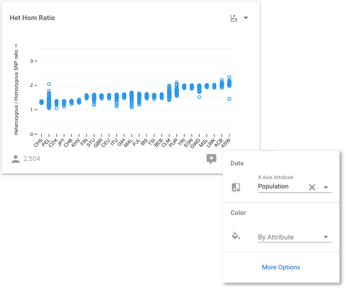
When we make this change, the y-axis shows the HHR, but the x-axis has no attribute, so all 2,504 samples appear at the same x position. We need to choose an attribute to use for the x-axis, and we can use any available attribute, but we are going to use Population. Click the control button at the bottom right of the chart to make this change. Select Population for the X Axis Attribute, and we now see the distribution of values for all samples stratified by their population.
We can go a step further. We know that the 1,000 Genomes populations are members of Super Populations, so it would be informative to know the Super Population that each individual Population belongs to. We will achieve this, by colouring each sample according to its Super Population. We use the same control button as before:
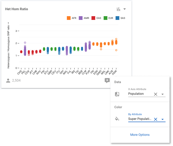
Now we can see, for example, all the East Asian (ASN) populations shown in red. If we select More Options (in the modal shown in the figure above), or use the control to select Fullscreen, we move to a fullscreen view of the chart where we have even more visualization options. For example, we can modify the axes scales, bin sizes (when working with histograms), sort the data, and more. We want to see if the HHR is correlated with ancestry, which we can investigate by sorting the data by the Super Population.
All the populations are now grouped with the others in their Super Population, and we can see that HHR is similar within a Super Population. By selecting Show Group Median Lines, it is even easier to compare all these population groups. The outlier to this behaviour is the AMR (or American ancestry) population, whose constituent populations differ significantly. Since AMR is an ad mixed population, this is not a surprising result. We aren't limited in what we can sort the data by though. For example, we could sort by the Het Hom Ratio attribute instead.
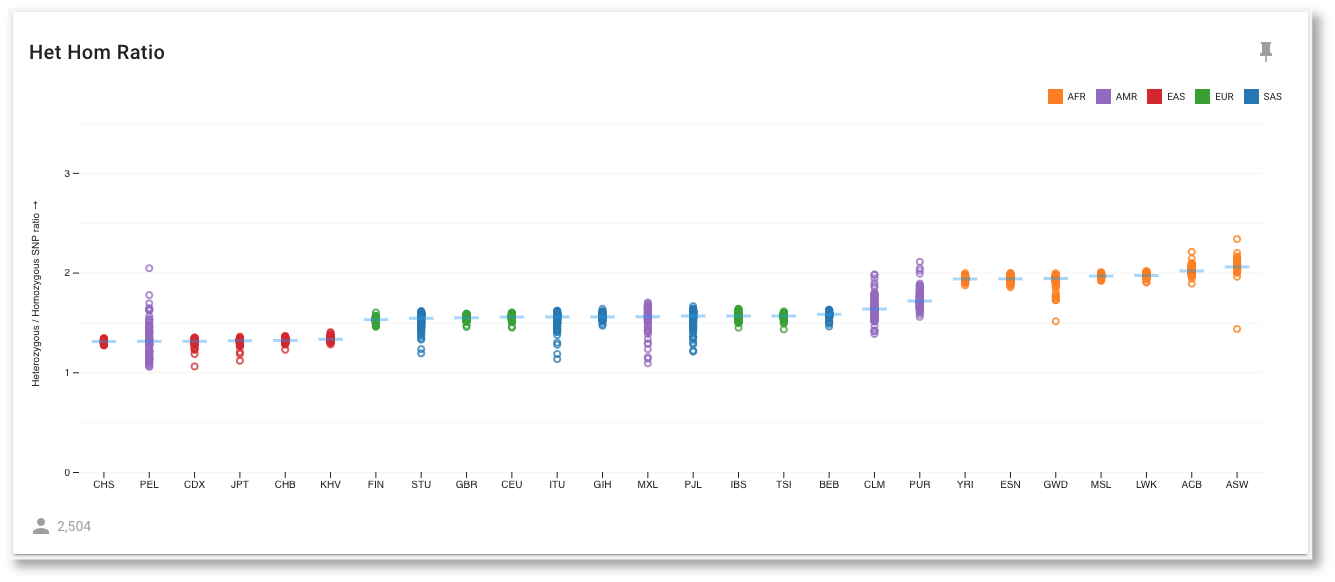
We can see that the African (AFR) populations all cluster at the far right with HHR values of close to 2. The expected value for this ratio has been proposed to be 2, so this is close to expectation. The other, younger, populations have all undergone several bottlenecks through global migrations, leading to reduced values for this ratio. We can also see that the purple AMR populations have a larger spread of values compared to the other populations, which would be expected of these ad mixed populations.
Save / Export Charts
Finally, we can leave the fullscreen view using the breadcrumbs above the chart, and return to the Analytics view. All of the modifications we made while in fullscreen mode have been preserved in this view though. We can download this chart as a png or an svg for use in other applications. Svg can be particularly useful as you can edit it in applications like Adobe Illustrator to remove elements, change colours, edit text, highlight areas, etc.