Deeply Integrating Visualization in Genomics
Genomics continues to increase the rate of data generation, with several projects exceeding or about to exceed 100,000 individual genomes. A (or perhaps the) major challenge today and even more so in the future is how to get more information and value out of this rich data. I believe the best and most achievable way to do this today is with visualization. Visualization has always been the best tool to help people intuitively understand complex data and in doing so help them not only select the right question to start with but also find even better questions along the way.
Visualization, however, is rarely used to its full potential in genomics. The most common way visualization is used is after the analysis or investigation has been completed. Here the "answer" has already been determined and the visualization is simply a means to communicate that knowledge to as large a group as possible. To get more out of visualization (and our data!), we can use it earlier in the analysis process when the answers are still being gleaned. Given the huge increases in the amount of data and the diverse skillsets of researchers who need to work on this data, using visualization during the analysis is arguably where it's needed most.
To be effective during analysis, visualization needs to be more than just a picture. It needs to be deeply integrated into the workflow. This means the visualizations are generated automatically and they are interactive, allowing a researcher to make further decisions (e.g. zoom in, filter, include additional metrics, export, etc). Visualizations shouldn't be a dead-end, but rather seamlessly integrated into the workflow as a step with input and output. This takes effort, but visualization used in this way has the potential to quicken the analysis, empower non-technical users, and derive a greater percent of the information and value from the dataset.
In this blog post I will go over 2 areas during the genomic analysis/investigation where visualization can have a significant impact.
Step 1: Data Exploration (or how do I find the datasets I need?)
What is data exploration?
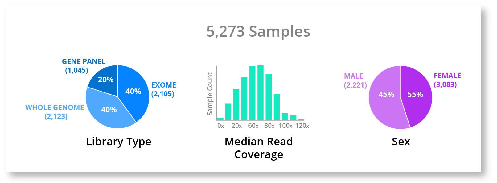
Data Exploration is about finding the data resources that are available to you, quickly understanding what each dataset offers on a high level, and ultimately selecting the dataset(s) you need to achieve your goal. This typically involves spelunking around shared drives via the command line trying to intuit what a dataset offers from the directory name, accounting for up to 25% of a data scientists time. To be productive in this environment a user would need a deep understanding of the organization's data already, requiring hundreds of hours of time. This hurdle is sufficient to effectively exclude most people at your organization from performing this step themselves and creates a gatekeeper to the data. This sounds bad and it is. Some of your organizations best ideas may never be explored or followed up because they simply can't get started. This is where visualization is transformative.
How visualization helps
For example, lets say a user wants to grab all datasets that are whole genome data with median coverage of at least 50x (no old data please) and let's say you are interested in a X-linked disease so you want to only include males. This would be quite challenging and require significant time and technical expertise to accomplish on the command-line. However, if we had a simple visualization like the one below, I would say that most if not all people would be able to at least know the data they were looking for exists.
But visualization by itself can only take us so far. To take the next step and truly make this quick and easy for most people to do, we need to integrate this visualization deeply into the workflow, tools, and filesystem. If we add a little interactivity, the user would even be able to select the data straight from the charts and pull it into their workspace.
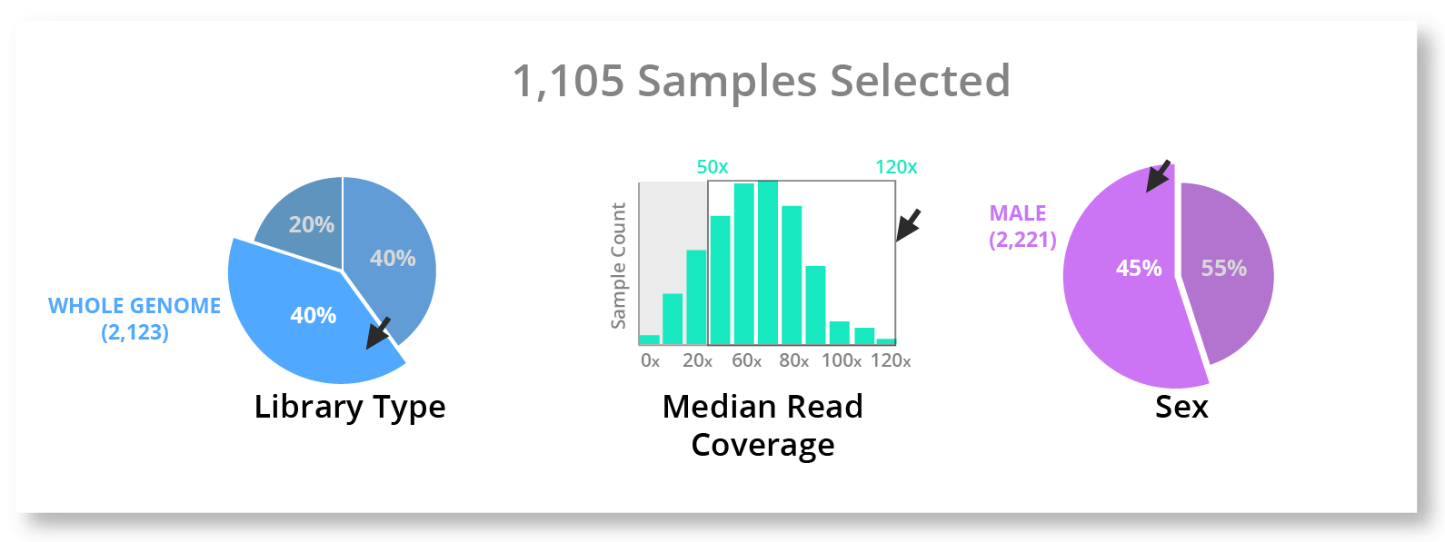
This is really the end goal - to have visualization seamlessly integrated with your workflow and filesystem in a way to make finding, selecting, and exporting data quick and easy for most people.
Goals of Visualization in Data Exploration
I think it's also important to understand the goals of the data exploration stage, so that we can craft an effective visualization. A visualization for data exploration has very different goals and should be designed differently than e.g. a figure for a paper.
- High Level / Summarizing Visualizations.
- Standard visualizations - easy to understand and can serve a wide range of expertise. Remember we are shooting to let everyone have access to this data so keeping it as simple as possible is critical.
- Interaction - facilitate further actions (e.g. zoom, filter, add metrics, export, etc)
- Global-level visualizations - cut across directories, datasets, and data silos. To get the most out of your datasets you need to know what data to slice, pluck, and merge.
Step 2: Data Analytics (or what is the data telling me?)
What is genomic data analytics?
Data analytics is the process of examining raw data to draw conclusions about that information. It also encompasses broader goals such as enabling an intuitive understanding of the dataset and provoking new questions for further investigation. Data analytics has exploded through the use of business intelligence software, becoming a standard tool in many businesses. In genomics, we don't always call it data analytics, but this is exactly what we are doing when we are analyzing datasets to uncover deep relationships between phenotype and genotype or are identifying issues with the quality of our data. However, the standard data analytics tools are not equipped to work natively with genomic data due to the enormous size, complexity of the datasets, and domain-specific data formats. For a researcher to explore a question in this environment, they would need to write custom scripts to parse and transform the data, perform a custom statistical analysis (via a script or excel if data is small enough), and spend many hours tuning the results. This approach can often bear fruit, but it takes significant time and effort, hindering the total number of ideas/questions an individual can explore. If our goal is to get the most out of our datasets, the total number of hypotheses an individual can confirm or invalidate per day is the most important metric to optimize for. Once again deeply integrating visualization into this can solve some of these problems and in this case we can even look to the business intelligence software to see how much benefit adding visualization to analytics can give.
How visualization helps
Let's say, for example, a researcher wants to understand what relationship smoking has on the likelihood of developing a specific disease phenotype. In most organizations this would require technical skills and a significant (> 1 hour) amount of time. However, if we have visualization deeply integrated into our workflow, we can visualize the information quickly, enabling us to greatly speed up the process, improve our understanding of the data, and even increase the thoroughness of our investigation. Our first step is to just see what phenotype and meta data we have associated with these samples, so let's pull that up.
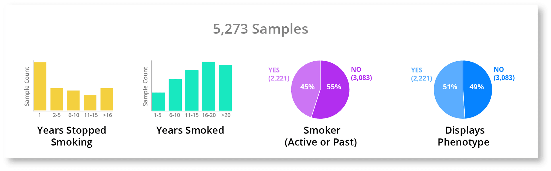
We have a lot of good meta-data associated with these samples. If we didn't know all of this existed we might just jump straight to creating a group of smokers and non-smokers to generate our statistics, which may not extract the subtlety of the relationship like a more thorough analysis using all of these smoking attributes. Also, we have a nice fairly even split between smokers vs non-smokers and also between people who possess the phenotype vs those that don't. This quick look gives us a much better understanding of the whole dataset and will let us better contextualize the results to come. The next thing we can do is just to chart each of the smoking attributes against whether an individual displays the phenotype of interest. This gives us a quick look at the relationship between all of the smoking information we have and this phenotype.
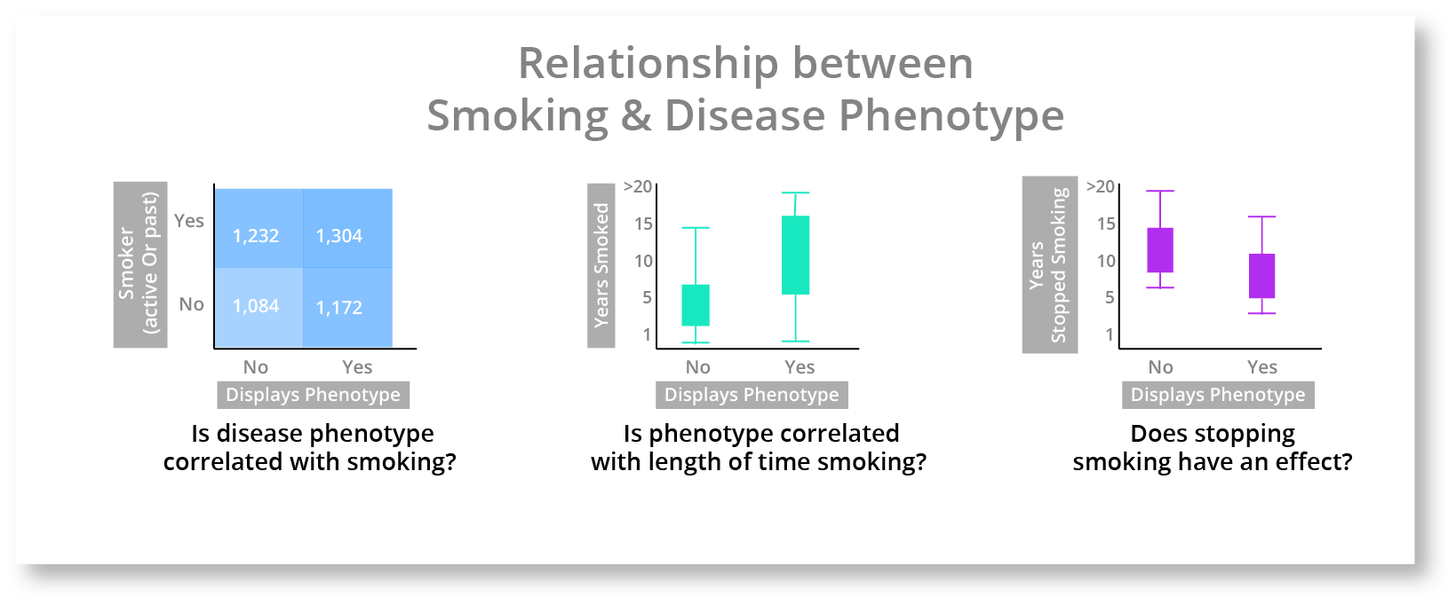
The leftmost heatmap that contains both active and past smokers does show a slight increase in the top right square, but it isn't very compelling. The middle boxplot chart shows that the length of time that a person smokes seems to have an impact. The rightmost boxplot chart shows that stopping smoking also seems to have an impact. These charts are hinting that there is a complex relationship between smoking and the disease phenotype, but isn't elucidating the nuances of that relationship very well. As a quick aside, this is a critical part of genomic analytics, where a researcher can quickly determine where a deeper relationship may be, so that they can investigate further. These charts aren't giving us the answer but they are helping inform and guide the investigation. We can go one step further and create a chart with all 3 of these attributes (Disease Phenotype, Years Smoking, & Years Stopped Smoking) to get a better look.
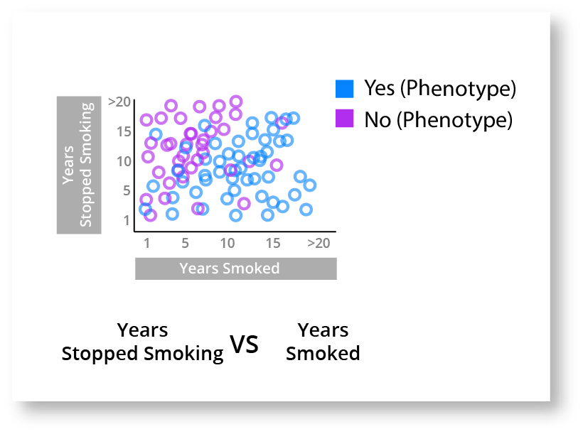
This chart gives us a much better understanding of what is happening. It looks pretty clear that the longer you smoke the higher the risk of displaying the disease phenotype, however if you stop smoking then your risk decreases each year you don't develop the disease phenotype.
Goals of Visualization in Genomic Data Analytics
The goals of visualization in this step are two fold (1) better understand the dataset, including its strengths and weaknesses; and (2) start to identify trends.
- Identify datasets attributes - this would include all phenotype data (e.g. smoking), meta data, and quality data.
- Quick Cohort Creation - to explore many ideas, it's essential to be able to dynamically create cohorts.
- Add simple statistics - visualization is good for provoking ideas, but at the end of the day you need statistics to prove it.
- Export (e.g. data, cohorts, samples) - to be effective a visualization can't be a deadend. It needs to allow exporting for further downstream analysis.
With these two steps, I hope I've shown how visualization is much more than just figures and in fact how it is the missing piece in helping us get more out of these huge biological data sets.
-- Chase
Here at Frameshift we are hard at work improving how people interact with genomic data and are actively applying these ideas into our flagship product Mosaic. If you are interested in genomic visualization and genome-scale analytics (or even just like to talk about these ideas) get in touch info@frameshift.io!
OR
Create a free account in Mosaic today.