Intro to Analytics & Charts
The Analytics page is made up of interactive charts to give users a quick view of all their attribute data. For a project, Analytics will visualize all of the projects sample-level data (i.e. sample attributes). This is often phenotype data (e.g. height, age of onset) and QC data (median read coverage, sex prediction). For a collection, Analytics will still show your sample-level data but will also visualize the project-level data (i.e. project attributes). Project level attributes are often useful for storing status and other information like diagnostic status, processing status, analyzing organization, etc.
Analytics provides a powerful way to quickly view, filter, and export lots of sample and project information.
Select Charts
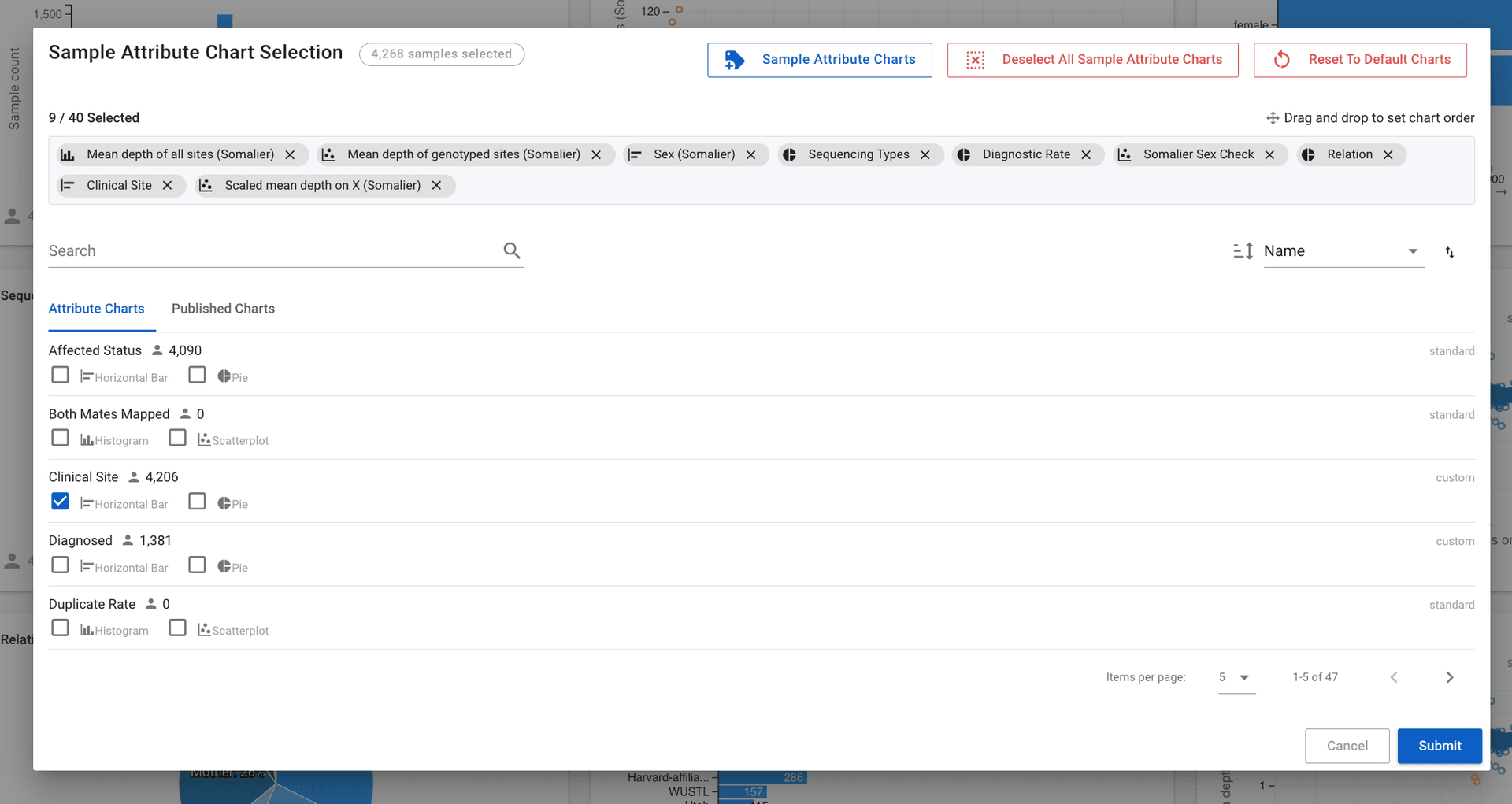
Charts in Mosaic are generated whenever an attribute (sample attribute or project attribute) is added to a project. This often results in hundreds of potential charts to view. The analytics page allows you to view all charts at once but it is normally better for clarity and speed to only select the charts of interest. To select which charts to view go to the analytics page and click the select charts button. Here you can select the charts you want and can select the order of the charts by moving around the gray chips (![]() ) at the top of the page
) at the top of the page
Filter & Compare Data
After selecting the charts you want, you can view them all on the analytics page.
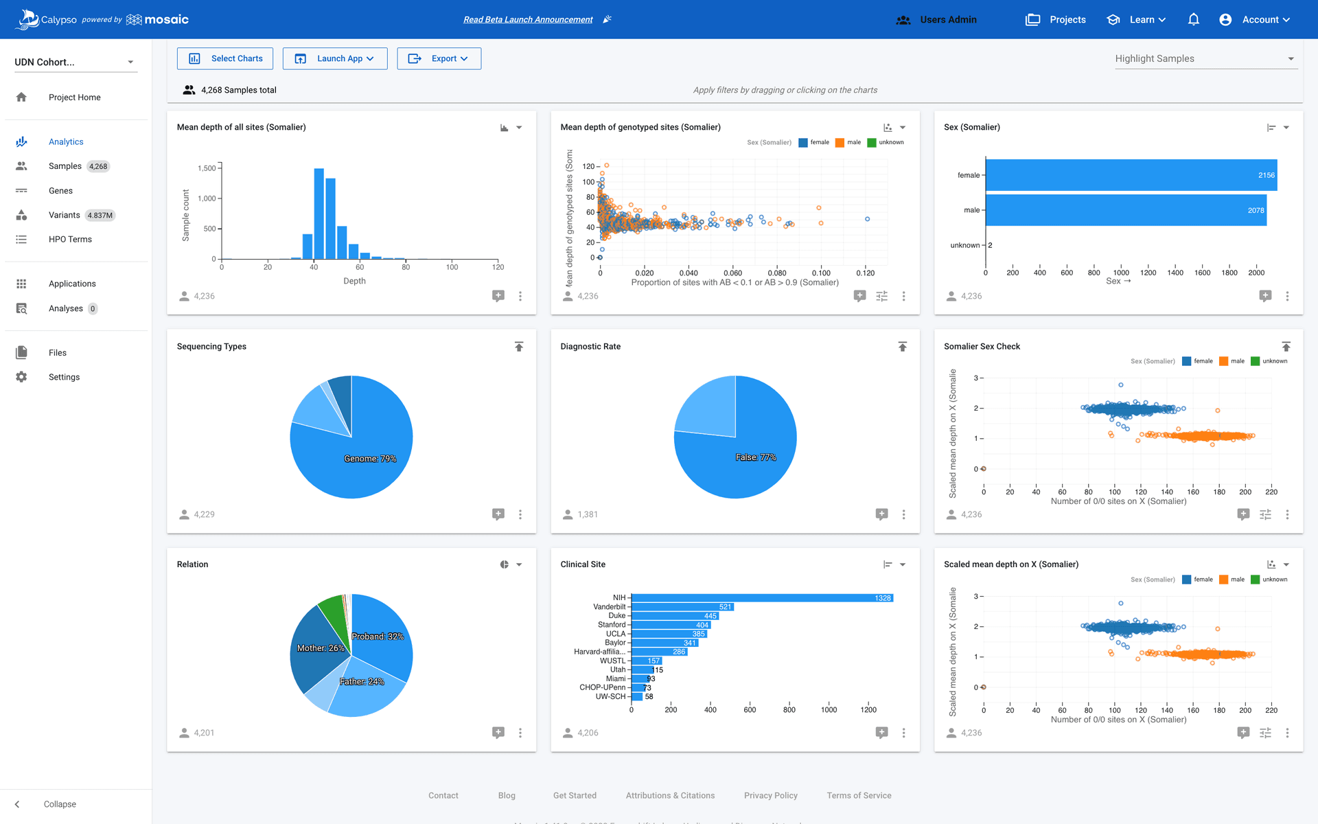
From here you can start interacting with the charts. For example you may decide that you only want to select the female samples. You can do that by selecting the female bar on the Sex horizontal bar chart as shown in the gif below. This will cause a second chart to slide down from under the Sex chart. This new filtered chart only shows the samples that you selected i.e. the female samples.
However the Sex chart isn't the only chart to get a second filtered chart. All the charts will get a new chart that only shows the samples that pass the filter in this case only female samples.
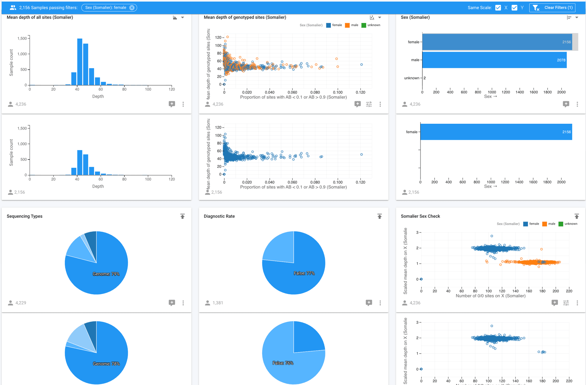
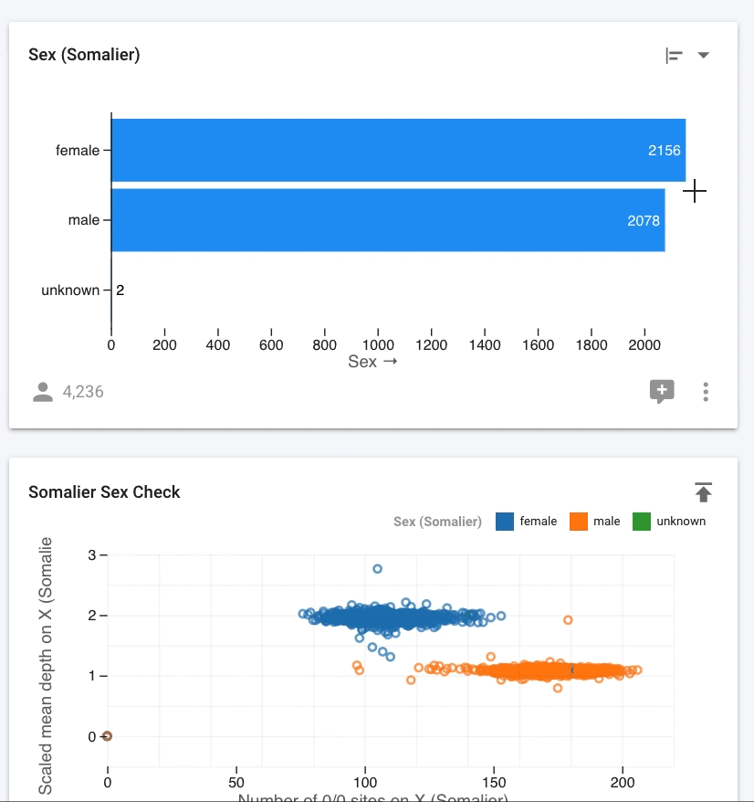
Looking at the rest of the charts you can notice that the Somalier Sex Check chart (a QC chart to identify incorrect sex) shows some blue female samples clustered with the orange male samples, which is very obvious in the Somalier Sex Check filtered chart.
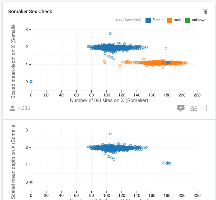
This could be a sign that those samples have the incorrect sex. We'll want to grab those sample names and look into it. To export just those sample names go on to the next section
Export Samples/Projects Based on Visual Cutoffs
We have identified a handful of samples with a potential QC error. From the previous section we have selected all the female samples, but we really only want to export the handful of mis-clustered samples. Fortunately you can filter on multiple charts at once, so all we need to do is add a second filter on the Somalier Sex Check chart where our samples of interest are. You can't filter on filtered charts so we'll apply the filter to the original chart.
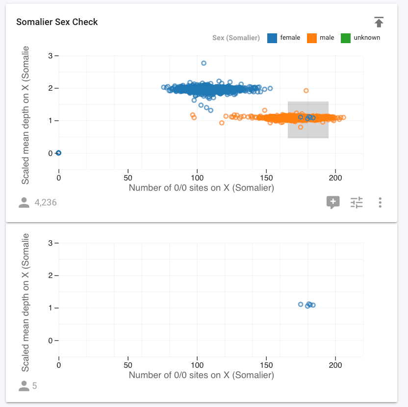
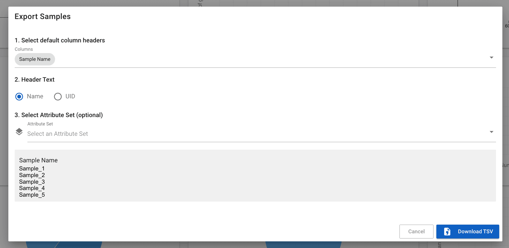
With the 5 samples of interest selected, we can export by going to the export menu and selecting export passing samples.